Android
The Galaxy Z Fold 8 Has the Right Shape…but Android Apps Aren’t Ready Yet
The Galaxy Z Fold 8 may be Samsung’s most interesting foldable in years, and not because it is thinner, faster, or packed with more AI.
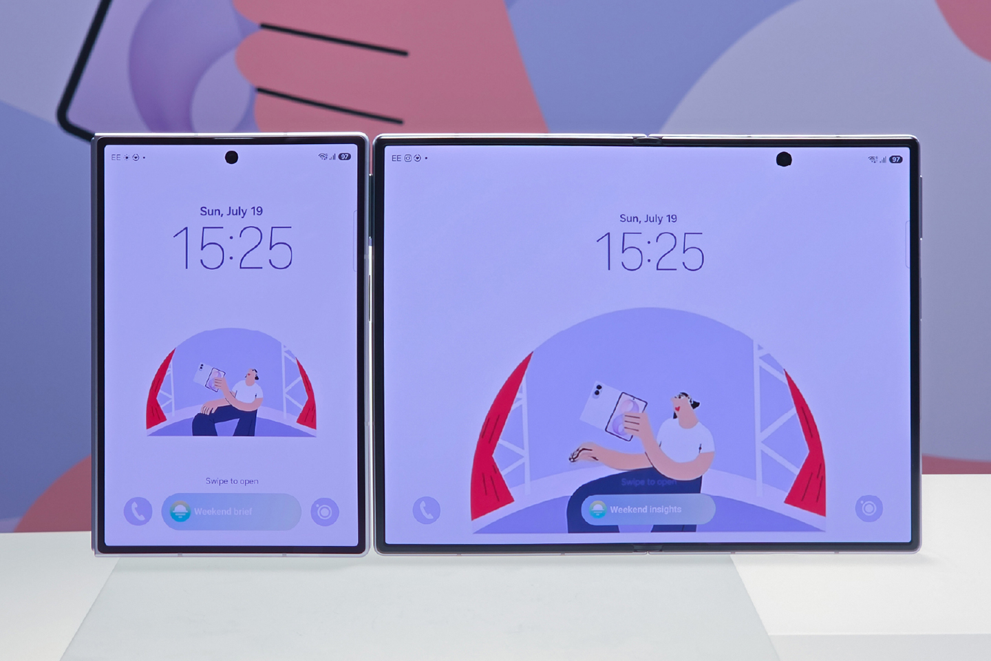
It is interesting because Samsung finally changed the shape.
The Fold 8 has a 5.5-inch cover screen with a 10:16 aspect ratio. Open it and you get a 7.6-inch display at 4:3. Instead of another unusually tall phone that unfolds into a nearly square tablet, the Fold 8 feels closer to a compact widescreen phone on the outside and a small iPad on the inside.
On paper, that sounds like the right direction. In practice, it is exposing how unprepared many Android apps still are for foldables.
The Fold 8 may have the right aspect ratio—and the wrong apps for it.
Why the New Shape Makes Sense
Samsung describes the cover screen as better suited to short-form content, while the unfolded 4:3 display is intended for movies, games, reading, and web browsing. Rotate the open phone and that same screen becomes 3:4, giving documents and websites more vertical space. (Samsung)
That flexibility is the Fold concept at its best.
The outer screen is wide enough to feel usable instead of like a narrow remote control. The inner screen resembles a familiar tablet canvas rather than an enlarged phone. Documents, ebooks, websites, photo editing, retro games, and two-app layouts should all benefit from the proportions.
The 4:3 panel also wastes less space around widescreen video than the more square Fold 8 Ultra. There are still black bars, there always will be when a 16:9 movie plays on a 4:3 screen—but they are smaller. Review testing found that the usable video area is not necessarily larger than on the Ultra; there is simply less unused display surrounding it. (Tom’s Guide)
This is not Samsung choosing a bad shape. It is Samsung choosing a shape that asks more of Android software.
Apps Still Think Every Phone Is Tall and Narrow
Most Android apps were designed around a safe assumption: a phone held vertically will have a tall, narrow screen.
The Fold 8 breaks that assumption.
Its cover display is shorter and wider than a conventional smartphone screen. Apps that rely on fixed proportions can respond in several unhelpful ways. They may add black bars, shrink the interface, crop content, stretch video, or position controls as though more vertical room exists than is actually available.
Instagram is an early example. Fold 8 owners have reported Reels initially filling the display and later appearing smaller with large bars at the sides. That inconsistency is arguably more irritating than permanent letterboxing because the user knows the app can fill the screen—it simply does not do so reliably.
Other apps technically work but do not feel designed for the display. Content may be centered inside unused space, navigation elements can sit unusually far apart, and feeds may show less information than expected despite the wider panel.
The cover screen is more comfortable to hold and more useful for normal tasks, but an app that refuses to adapt can erase much of that advantage.
Unfolding Can Break the Illusion
The real magic of a foldable should happen when you open it.
An app should recognize the extra space, reorganize itself, and continue exactly where you left off. Gmail can move from a conventional inbox to a two-pane view. WhatsApp can place the conversation list beside the selected chat. These are the experiences that make a foldable feel like more than a phone with a large screen.
But that transition is not universal.
Some apps fail to redraw correctly when moving from the cover display to the 4:3 interior. A reviewer found that apps would sometimes need to be restarted after unfolding before they properly recognized the new aspect ratio. Other apps remain trapped in their phone layout or enforce a fixed window shape. (T3)
That interruption sounds minor until it happens repeatedly. The entire appeal of the form factor is continuity. If opening the device means closing and relaunching the app, the fold starts feeling less like a seamless transformation and more like switching between two imperfect screens.
The Tablet-Layout Problem
There is another complication: a wider display can cause an app to assume it is running on a tablet.
That is useful when the tablet interface is genuinely adaptive. It is less successful when the app merely crosses a width threshold and swaps in a layout designed for a much larger screen.
The result can be an interface with oversized empty areas, tiny content panels, widely separated controls, or too many columns fighting for limited vertical space. Rotate the Fold 8 and the problem can change again because the available width and height effectively trade places.
Games introduce their own problems. A title built around a fixed 16:9 canvas may display large bars, stretch the picture, or crop the edges. Touch controls near those edges can become uncomfortable or partially obscured. Forcing the app to fill the screen does not necessarily fix it; sometimes it just converts unused space into missing content.
Samsung Gives You Controls, but Not a Cure
One UI lets users adjust the aspect ratio for individual apps. The option can be reached through Samsung’s display settings and, in some cases, from an app’s card in the recent-apps view. Good Lock and its MultiStar module provide additional foldable-specific controls.
These options are valuable. They are also workarounds.
Forcing an app into full screen may remove the black bars, but it cannot create a responsive interface that the developer never built. Text and images may be cropped. Buttons can shift into awkward locations. Video may be zoomed beyond the frame. An app can occupy every pixel and still use the display badly.
The user is left experimenting with settings on an app-by-app basis—and sometimes choosing between two different kinds of broken.
That is a lot of maintenance for a phone positioned as a polished, premium device.
Google Knows This Is a Problem
Google has begun pushing developers to support what it calls “ultra-wide foldables” such as the Fold 8. Its guidance tells app makers to stop making assumptions about orientation and display size, use fluid layouts, and calculate the space actually available to an app—especially during split-screen and multitasking. (Android Developers)
That guidance is encouraging. It also confirms the underlying issue.
The Android ecosystem has spent years talking about adaptive apps, but too many popular applications still treat foldables and tablets as enlarged phones. Samsung can improve One UI, offer per-app overrides, and build excellent multitasking tools. It cannot rewrite Instagram, every banking app, every streaming service, and thousands of games itself.
The Fold 8’s new proportions make those shortcomings much harder to ignore.
A Better Foldable With an Early-Adopter Tax
None of this makes the Galaxy Z Fold 8 a bad device.
In fact, the frustrating part is that Samsung may have landed on the better design. The cover screen is more practical for one-handed use. The 4:3 interior is excellent for reading and productivity. The phone is lighter, the crease is less distracting, and the aspect ratios give each display a clearer purpose.
The drawbacks come from the gap between what the hardware can do and what apps expect it to be.
Well-adapted software makes the Fold 8 feel like the future: open the device, watch the interface reorganize itself, and use the additional space without thinking about it. Poorly adapted software produces black bars, awkward scaling, cropped controls, wasted space, and occasional restarts.
Owners experience both versions of the phone every day.
That makes the Fold 8 an impressive device with a familiar early-adopter tax. Buyers are not merely paying for Samsung’s newest hardware. They are also beta-testing a new display shape while the Android ecosystem catches up.
The Fold 8 does not prove that the new aspect ratio is wrong. It proves that getting the hardware right is only half the job.
Publishing Notes

Written by
Bryan
Independent technology coverage focused on useful context, real-world experience, and honest recommendations.