Apple
macOS Golden Gate Beta 6 Just Gave the Mac’s Traffic Lights a Major Redesign
Apple’s latest Golden Gate beta quietly transforms one of the Mac’s most recognizable interface elements.
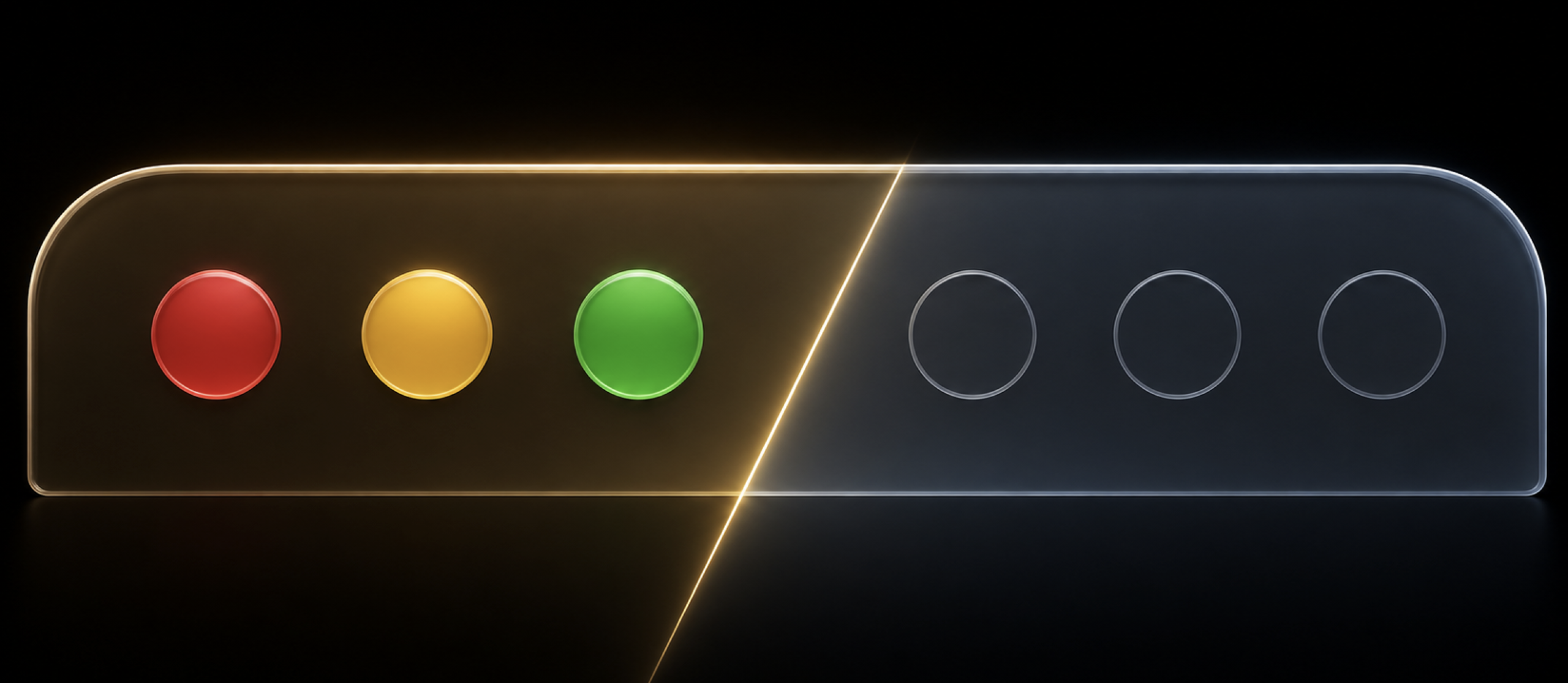
macOS Golden Gate Beta 6 includes the usual collection of fixes and under-the-hood changes, but the first thing I noticed had nothing to do with performance, Apple Intelligence, or a new application.
It was the three circles in the upper-left corner of every Mac window.
Apple officially calls them window controls. Most Mac users know them as the traffic lights: red to close, yellow to minimize, and green to zoom or enter full screen.
In Beta 6, Apple has given them a surprisingly substantial visual refresh.
The Mac’s traffic lights have lost their color
The previous Golden Gate design retained the familiar red, yellow, and green circles. They were bright, immediately recognizable, and visually separated from nearby sidebar, navigation, and toolbar controls.
Beta 6 takes a much quieter approach.
The three buttons now appear as lightly outlined, nearly colorless circles that blend directly into the title bar. The borders are thin, the contrast is significantly reduced, and the entire group feels more integrated with Golden Gate’s glass-inspired interface.
Before: The traditional red, yellow, and green window controls.
Beta 6: Three subtle monochrome circles integrated into the title bar.
Depending on the window’s state and whether it is active, macOS may still use color to communicate focus. Apple’s own design guidance explains that active windows traditionally use colored controls while inactive windows use gray. The important change here is the dramatically subdued resting appearance and the way the controls now fit into the surrounding interface.
It is cleaner. It is calmer. It is also considerably less obvious.
A small change with a big visual impact
These buttons occupy only a tiny portion of the screen, but they are among the most recognizable elements in macOS.
For decades, the traffic lights have immediately told users that they are looking at a Mac window. They also provide useful visual information without requiring labels or explanation. Red, yellow, and green are understood almost instantly.
The Beta 6 design reduces that visual noise, helping the controls disappear until they are needed. That fits Golden Gate’s broader design direction: softer surfaces, fewer competing colors, and interface elements that feel embedded in the window rather than placed on top of it.
But Apple may have pushed the minimalism slightly too far.
The new controls look elegant when viewed as part of the complete title bar. In isolation, however, they resemble three empty circles. The individual functions are less obvious, particularly for new Mac users or anyone switching between macOS and another operating system.
This is the familiar tension at the center of modern Apple design. The company wants controls to feel lighter and less intrusive, but reducing visual weight can also reduce discoverability.
Golden Gate is becoming visually more consistent
The redesigned window controls make more sense when viewed alongside the rest of Golden Gate.
Buttons, segmented controls, sidebars, toolbars and menus are all becoming softer and more restrained. Beta 6 continues moving macOS away from isolated, brightly colored interface elements and toward a more unified system of glass, outlines and contextual emphasis.
The result is a title bar that feels less crowded. The traffic lights no longer compete with sidebar toggles, back and forward arrows, or application-specific toolbar buttons.
That consistency is valuable. Previous Golden Gate betas occasionally looked like the classic macOS interface had been placed on top of an entirely new design system. Beta 6 feels more deliberate.
The question is whether Apple can preserve enough of the Mac’s personality while pursuing that consistency.
A Mac without its colorful traffic lights feels just a little less like a Mac.
Beta 6 also fixes several important problems
The visual redesign is not mentioned in Apple’s developer-facing notes, but the official macOS Golden Gate Beta 6 release notes document a substantial collection of fixes.
Apple says Beta 6 resolves an issue that could cause high-memory Macs to incorrectly report filesystem metadata corruption when running First Aid. It also fixes problems involving the Dock remaining visible after Mission Control, windows becoming lost when leaving full-screen mode, and Terminal temporarily hanging after users clicked Terminate.
There is still at least one notable Wi-Fi settings bug. Apple says the Details button under System Settings → Wi-Fi may do nothing. The workaround is to open System Settings → Network → Wi-Fi → Details instead.
These are the kinds of corrections expected as Golden Gate moves deeper into its beta cycle. Beta 6 feels less focused on introducing major features and more focused on making the operating system coherent, dependable and ready for everyday use.
My early verdict
I like the direction more than I expected.
The new window controls fit Golden Gate considerably better than the traditional traffic lights did. The title bar looks cleaner, and the controls no longer dominate an interface that is otherwise becoming softer and more refined.
I am not convinced Apple has found the perfect balance yet.
The outlines may be too faint, and removing so much color weakens one of macOS’s most familiar visual signatures. A slightly stronger border or a restrained amount of color, could preserve the cleaner appearance without making the controls feel anonymous.
That is what beta software is for.
Beta 6 shows Apple is still willing to make meaningful visual changes rather than simply polishing the design introduced in the first developer beta. The Mac’s traffic lights may be small, but this redesign changes the character of every window in the operating system.
For better or worse, Golden Gate is beginning to look like its own version of macOS.

Written by
Bryan
Independent technology coverage focused on useful context, real-world experience, and honest recommendations.